

Usability case study
Wish is a mobile app that connects shoppers to thousands of merchants to shop fashion, electronics, kitchen gadgets & more directly from the makers, paying 60-90% less than you would pay in store.
I was curious about this app, whose popularity has won it a spot on the "Trending" search bar of the iPhone App Store (July 2017). I downloaded and started exploring. I struggled navigating the app, and wondered if any other users have had the same experience. As a product designer and person obsessed with improvements, I decided this could be a great case study.
Note: I do not work for nor am affiliated with Wish app. I'm a passionate designer that likes to keep its skills sharp and to remain up to date with new tools/skills by doing side projects like this.
Conducting usability testing
I decided to proceed with guerrilla usability testing as a way to uncover user pain points. I conducted testing with 7 strangers that matched my hypothesized largest group of customers: professionals in their 20s and 30s and in a middle-upper income bracket. I asked individuals to perform tasks related to buying clothes, and asked them to verbalize their thoughts throughout the test.
Identifying problems
After reviewing all the usability test recordings, I decided to compile and analyze the information through an affinity map.
These were the main pain-points identified:

1. CUSTOMIZATION
7/7 users complained about not seeing things that they like/are interested in.
2. FILTER
5/7 users didn’t see the categories bar that serves as a filter and hence had a hard time to find the the things they like/are interested in.
3. SEARCH (RELATED TO FILTER)
4/7 users used search as a way to narrow down and obtain results quickly but also found too many results and no filters to narrow down their search.
Putting Feedback to Good Use with Jobs to be Done
JTBD helps you identify the role that products play in users’ lives, why they use the product, and how it improves their life. JTBD illustrates the “job” the user “hired” your product to do.
Here are my selected Wish Users' Job Stories:


Understanding the flow & ideating solutions
I decided to focus on these 3 pain-points and proceeded to do a task flow to get a better understanding of the process, the problems, and to start thinking about possible solutions.


Visualizing ideas
1. I chose to wireframe a few potential ideas that could be possible solutions to the pain points.
2. I narrowed down the wireframes by preliminary validation with a few users
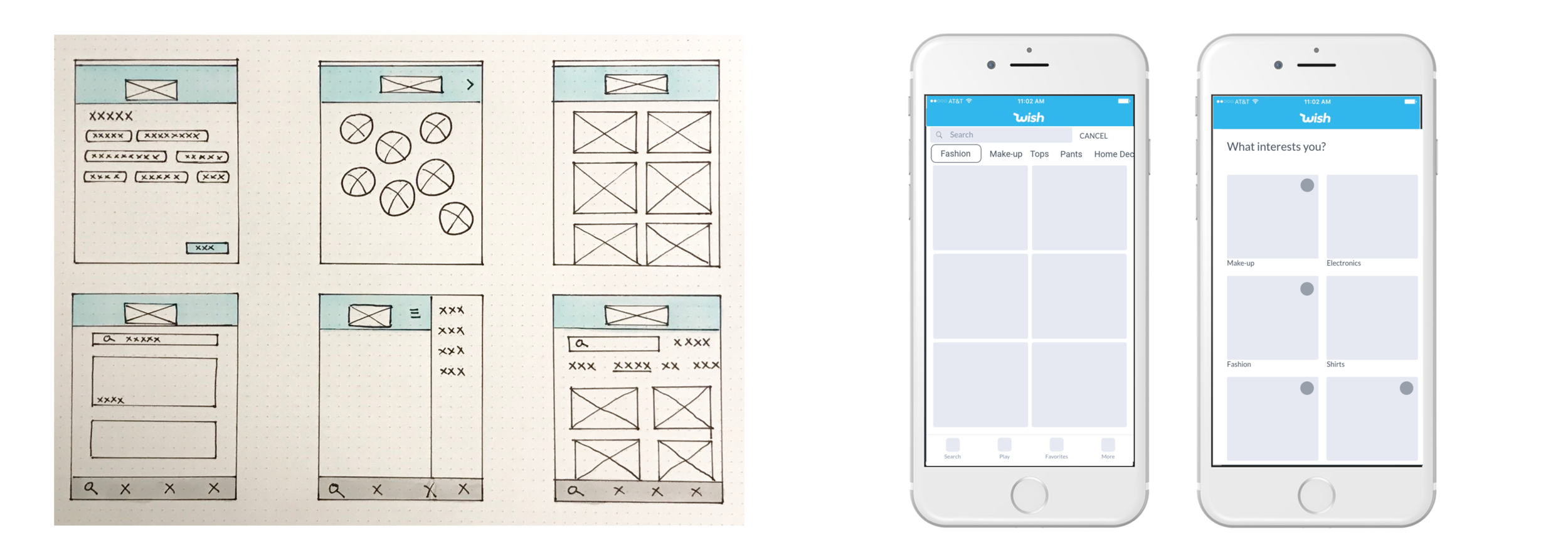
3. I started then to create hi-fi versions of my proposed solutions addressing each pain-point:


Validate
I validated my design using my working prototype to test another 7 different users maintaining all the other conditions constant.
These were the results:

Lessons learned
Preferences are important for customers even if they don't particularly know what they are looking for and just want to browse.
It seems very logical to think that if you don't know what you are looking for, it wouldn't matter to have a big assortment of options to look around, it actually seems like a great idea. However, when users are given extended options what they experiment is a feeling of being overwhelmed. Just think about the last time you went for ice cream and they presented you more than 20 options to choose from, how that made you feel?
Knowing what the user prefers to see helps to create a positive user experience through a customized feed, which then translates in the user spending more time in the app and finalizing a purchase.
Visit your virtual mall, click here:
