
www.heardnow.com
PREVENTING A FLOODED INBOX
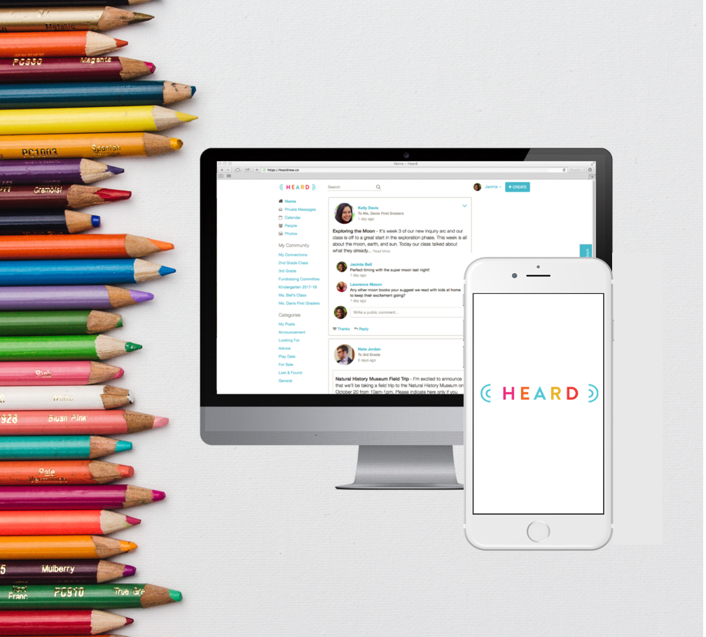
Heard is an all-in-one online communications platform for preK-5 schools that enables engagement for parents, educators and school administrators.
Heard, in its goal of keeping users informed and engaged was over-doing its efforts by sending too much information to users. The founders were receiving feedback from parents about being overwhelmed and were worried about users leaving the app. We were called in to help find a way to communicate more effectively and keep users happy with the app.
PROVING THE HYPOTHESIS
Our first step was going deep into user research to better understand the problem and to emphasize with our users.
As part of the process we conducted user interviews and usability testing with parents to gain insight into the spectrum of users and the reasons for their engagement or disengagement with the platform. To synthesize the insights, we used affinity mapping and as a result we found there were two type of users: engaged and disengaged parents. We wrote then personas and jobs to be done* to represent those parents so going forward we keep that in mind.
We discovered the hypothesis was correct and parents were overwhelmed. They were receiving too many notifications/emails continuously throughout the day with invitations to events, requests for volunteering, teacher's announcements and also emails per every comment made to any of those posts and messages. Parents inboxes were getting flooded.
Another interesting insight that we gained from this exercise was that most parents knew there was a way to adjust their notification settings but had not tried to do so.


We used the Jobs to Be Done framework to focus on finding the user’s motivations and the outcomes that lay behind those motivations.
JOBS TO BE DONE EXERCISE

APPROACH

We decided that a good approach to this problem was to understand what topics parents cared about the most which would provide us with a way to prioritize the information on the app reflected on the newsfeed and on the notifications sent to them.
We did a card sort exercise with parents and were able to put together a content prioritization list.
Rankings
- Teacher/school announcements
- School events
- Parent communication
- Outside events
- Classifieds
- Pictures
- Resources
Notifications Settings
We created different wireframes for the notification settings to perform user testing, some giving the user more power in personal customization, others giving them an easy and fast way to manage general notifications. Things that were taken into account for these designs were 1) the established content prioritization list, 2) moderators posts are considered more important to parents than community posts, 3) threads of comments, 4) the daily digest offered by the app.
Five different options for notification settings - LoFi Wireframes
I personally thought the design that allowed more customization was going to have a better success rate but I was actually wrong, parents preferred the simpler version of the notification settings.
Parents wanted a way to receive less notifications without having to get too involved in managing their notification settings (which also explains why the simplest version of the notification settings wireframe was rated higher than the granular version of it). We realized something that we hadn't considered before: the app's default settings.
The notification settings were set to the highest level by default, meaning that a first-time user would receive all the notifications/emails at all times. The users reacted by feeling overwhelmed, disengaging with the app or changing the notifications settings to none (we noticed they wouldn't change the frequency to low but immediately switch to none).
We worked on the redesign of the notifications settings to a screen where the user could choose between receiving all posts, posts generated by group moderators only or not receiving notifications. We also recommended the founders to adjust the default settings to receive notifications from MODERATORS ONLY instead of receive ALL notifications.
Newsfeed
LoFi Wireframes - posting in the newsfeed. How the newsfeed would look with icons, and how it would look once the user click to post and event or a question-
We worked in the newsfeed, using "create a post" as a starting point for categorizing. We tried out different designs. We started with a design with 7 categories, each associated with an icon that the user selects and is prompted to a pop-up window designed for the specific need. For instance, if the user needs to create an event, the fields for that post are going to allow that user to reach a calendar to add date and time easily.
Having the posts organized by categories allow the users to filter and to quick scan through the newsfeed for what they really cared about. We added labels and icons to all the posts so parents could scan the newsfeed quickly.
After prototyping, performing usability testing and collecting feedback from users and stakeholders, we decided on having 3 main categories for posts: general messages, events and requests for volunteering. These categories have proven to be the most used.
Photos and links/attachments were secondary on the level of importance so we included them inside the pop-up window after selecting the main category.
Announcements was the most important category and top priority on content and notifications. Nevertheless, it was being misused most of the time by users who didn’t understand the concept and their reach and the announcements were losing its importance.
In order to keep announcement meaningful on the platform we decided to change their name to “Alerts” and have them under general post, making it less obvious (and less tempting to click on them) and we also created a pop-up window that appears once the alert symbol is clicked with instructions on how alert posts should be used and as a reminder that all users in the groups would be notified immediately no matter what type of notification settings they have selected previously.
