

Created an user-friendly automated reporting tool to collect evergreen metrics from distributors for Coca Cola’s operations in Latin America. This tool allowed for easier access to historical records and for benchmarking between teams, with a visually compelling design that improved data management and communications, saving time and money.
the problem
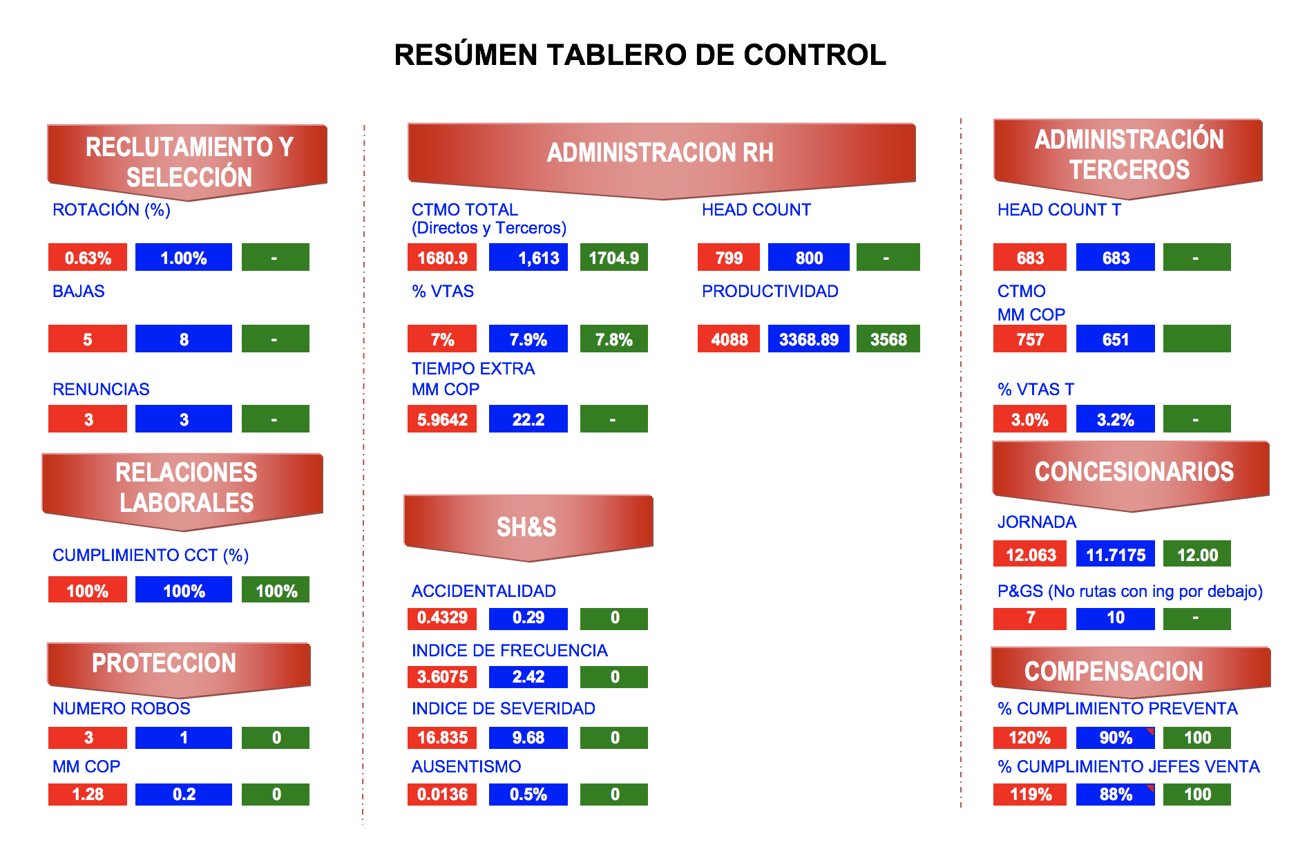
The Human Resources department of Coca-Cola Colombia tracks management metrics such as turnover, labor cost, head count, among others.
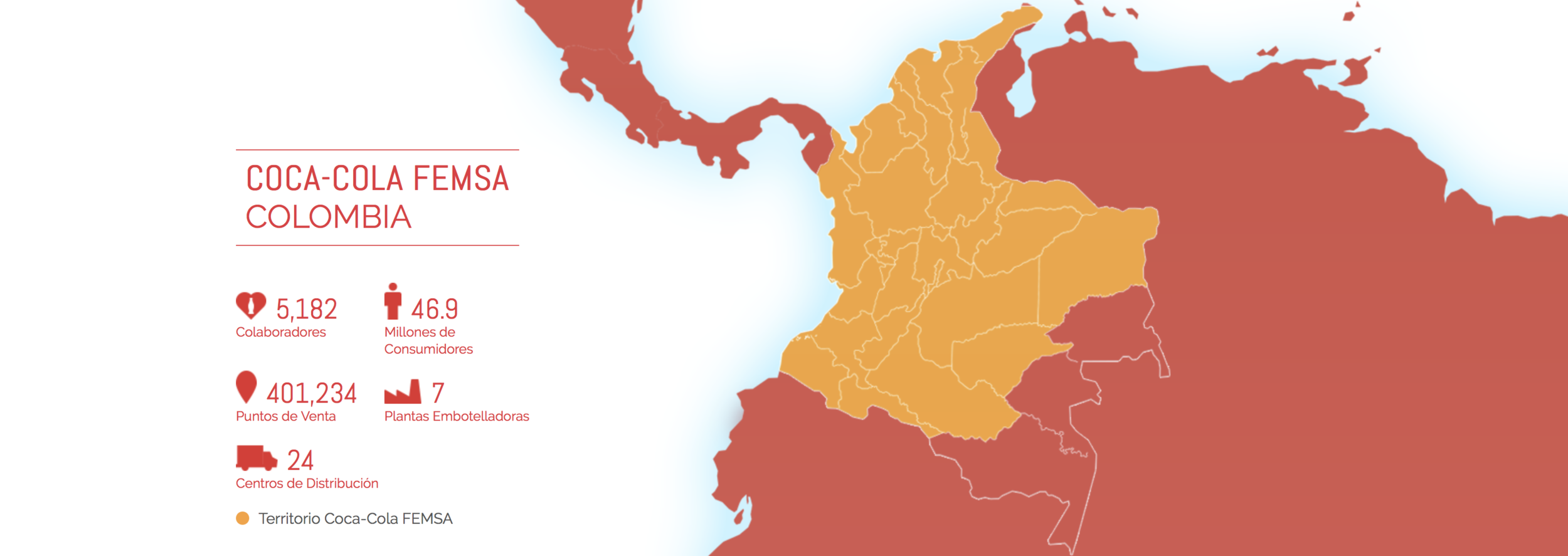
Coca Cola femsa colombia
Coca-Cola Colombia was organized with levels of responsibility and authority, including managerial work units known as "Las Zonas" (The Zones). I was part of the Zona Occidente (West Zone) that was in charge of the coordination of 6 different distributor units in the Country.
The importance of these indicators lies in their usefulness to show the health of human resources within Coca-Cola, allowing measurement of changes over time, and making it easier to evaluate in detail the results of initiatives and actions. In turn, this allowed for better decision making and for establishment and implementation of future staffing plans.
However, at the beginning of my work with Coca-Cola, there was no adequate system or database that would store and track these indicators. When the Human Resources department had any need for historical data, they would incur an exhaustive search for information that in many cases would yield no results and wasted time.
This was due to the metric collection being built manually in a pre-digital era by human resources personnel. This form of information collection was very difficult, took an inordinate amount of time, and would also lead to human errors and therefore lack of informational veracity. This unfortunately undermined the importance of the metrics and their tracking.
These shortcomings are where my project found its genesis.
before
Tableros de Control (Scorecards) were the presentations containing human resources metrics for each work unit team (distributors and zones) in Coca Cola Colombia. These presentations (Microsoft PowerPoints) and the metrics on them were created monthly, and presented to the Country Human Resources C-Suite members in one meeting held on the first 10 days of the month.
For Zona Occidente, seven scorecards were built, one being the compilation of the zones' data, and the other six were individual scorecards for every distributor in the country, each located in a different city.
Compiling these metrics and building the subsequent presentations was a manual process that started by requesting and receiving data from the different human resources teams in the different work units, then calculating metrics manually, and finally creating presentations with the resulting information.
The timeline for this process was a week (40Hrs) of work.
Lets check out some examples of metrics calculated every month:
Head Count Terceros (outsourcing head count),
This metric indicates the number of people working at a distributor unit under contract per month. There are different categories for the employees under this type of contract; to find out the number for each category, I would (1) look at a spreadsheet that was sent to me that month, (2) find the number of people that belonged to that specific category, (3) return to my file with the indicator table, (4) write it down in another spreadsheet, and (5) finally, repeat this process for each of the categories to get to the total head count. Columns AA (current year vs. previous year) and MA (current month vs. previous month) were also calculated manually by revisiting old spreadsheets or presentations from previous years, that frustratingly, weren't always available saved.
This process was done for each distributor + zone, meaning it was done seven times every month.


Costo Laboral Terceros VS Presupuesto (outsoursing cost vs outsourcing budget),
This metric sums up the outsourcing cost (6 different types) and compares it to the original budget per month. A graph for each of these itemized costs and for the total cost needed to be built for the presentation for each of the work units and for the whole zone. In order to do that, there were two different files, one with the actual cost and one with the budget, and the data were manually input into a spreadsheet to create the graph needed for the presentation.
A quick formula to understand the magnitude of the process:
6 graph to be built for this metric x 7 presentations = 42 graphs to build manually per month.
dashboards
Once all the metrics were input and tabulated, a table summarizing the trends needed to be compiled per each presentation by inputting the data one by one into the presentation. As you can imagine it was a tedious and long process! After experiencing this pain point, I knew there had to be a way to optimize this process. I proposed to find a solution, and thus my project was born.
the design process

I decided to structure the project in 4 stages: definition of the project, collection and organization of information, construction of the file, and delivery of the project.
In the first stage, I dedicated myself to understanding and defining the problem, and to establishing clear objectives for the project. I already had the experience creating the metrics and creating the presentations for the Human Resources Management, so already I had identified key areas of improvement to the processes. I proceeded to do user interviews with company senior management and the heads of human resources departments and their teams within the different distributors. I wanted to understand how these teams collected the data that they sent every month and how these metrics were used once they were transformed into tangible information via the presentations.
The second stage of the Project was the collection and organization of information. I now had a clear definition of the problem and in-depth insights from users. Therefore, determining the informational needs was a quick process that was followed by the search and collection of this information. This step actually took more time than planned due to the human resources department not having a system in-place to handle historical information, so I had to look for old files and email, and conduct interviews with different people who had institutional knowledge of the previous processes to obtain the pertinent information and then build the database.
Once I had all the data and information I needed, I proceeded with the third stage: construction of the file. This stage was very challenging but also very rewarding. I had to learn to create databases from scratch, to create complex formulas in excel and to do basic programming in Visual Basic, a engineer friend taught me some basics and google was the greatest tool on my self-teaching adventure. I also had to structure the file in a way that would make sense not just for the person elaborating the metrics but also for all the people involved in the process and the end users who would be seeing the file as a presentation. I learn after some time that this was called information architecture.
AFTER

The result of this project was an user-friendly automated reporting tool that collects and presents evergreen metrics from multiple distributors for Coca-Cola’s operations in Latin America. This tool allowed for access to historical records and benchmarking between units, with a visually compelling design that improved both data management and presentation communication, and gave the Human Resources Department management a strategic vision of its distributors' situation.
This tool was designed so it could be easily managed by personnel that are not familiar with Microsoft Excel nor databases, and used as a presentation tool that allowed on-the-fly interaction, serving the purposes of having clear and useful information at the department's fingertips. This increased recognition of opportunities inside the Human Resources Department and the company, and helped in improving the decision making process.
The manual labor of the metrics collation process was replaced by automation accomplished through a tool I created via Microsoft Excel formulas and Visual Basic programming, after self-teaching myself these skills. This tool now allows the person responsible for metrics tabulation to focus on the STRATEGIC ANALYSIS of the information, instead of tedious data entry. Through a quick monthly feeding of the databases, this work is now simplified with behind the scenes pre-programmed formulas. The time used in the creation of the scorecards went from 40 hours to 1 hour.
Apart from the decrease in the time needed to build the metrics scorecards, another great benefit was the more successful, streamlined use of information, thanks to the evergreen databases and dynamic tables and graphs that could be modified and organized according to the needs of the person reviewing the file. In short, this person could play with multiple variables of the database on the fly. Previously this was not possible since only a static image was available.
The automation of scorecards increases the accuracy of the information by decreasing the likelihood of mistakes, since manual work is prone to distraction and can result in erroneous data.
By significantly reducing the time of elaboration of the scorecards, you can make an exhaustive review of them to verify that there are no errors, and if there were errors these were also much easier to detect since they will find in the dats that have been updated in the bases data dek month, the rest is discarded because they are formulas and programming that will not change.
Another great advantage of automation is the elimination of reprocessing, because the indicators are built and presented in the same file, so 14 different files are not made (7 files with calculations, 7 files with presentations).
CONCLUSIONS

1. Automation is an useful tool in the continuous improvement of a company since it can achieve great advances in the efficiency of the processes, this can be evidenced in this project by how the process of elaboration of scorecards went from five days to one hour.
2. Databases are an excellent way to group, organize and store a company's data. These databases allow the use of programs to manipulate the set of data that facilitate the construction of relevant and valuable information, in addition to reducing the probability of error found in the work done manually.
3. The automation allows to increase the analytical work reducing or eliminating the operative work. In the specific case of this project, the automation significantly reduces the manual work, reducing the delivery time of the scorecards, which allows its users a longer analysis time that increases the probability of better decision making.
4. The new dashboard facilitates the scope of the indicators' objectives such as: measuring changes over time, seeing up close and evaluating results and initiatives or actions and allowing better decision making. This is achieved by generating added value by having a better form of construction and visualization of metrics, because in a single presentation all the information is available not only present data but also historical of each of the distributors and the Zona Occidente.